Configuration toolset that is part of the composable sdk, allowing the front-end to access the item configuration without loading a player.
What is the Composable Configurator?
It is a React-based toolset which enables the front-end to communicate directly with the ThreeKit platform in order to read the configuration data on catalog items. This is done without the need to load any particular player on the page. This is incredibly useful when the front-end UI needs to be built without having to wait for a player to load its assets.
It can work hand-in-hand with either the Classic Player or the Composable Player.
Installation
You have two options to install the Composable Configurator package into your existing React-based application:
Either install the package by itself directly:
npm i @threekit/configurator@latest
npm i @threekit/configurator@latestor as part of the Composable SDK installer:
npx @threekit/create-app@latest
npx @threekit/create-app@latestYou can then import all components, types, or hooks directly from "@threekit/configurator".
Getting Started
Building a front-end configuration form with the Composable Configurator is pretty straight-forward. We start by defining the authorization object with the correct credentials, then we pass it to the <ConfiguratorProvider>.
This component will provide the Configurator context to its children where we need to build the form.
<ConfiguratorProvider>
We would need to wrap our whole form in this context provider, including the player component containing the <Viewer> if we wish to pass configuration changes to its children easily.
The authorization is provided by the auth prop, using the ThreekitAuthProps type, like so:
import { ConfiguratorProvider } from "@threekit/configurator";
import Form from "../components/Form";

export default function Home() {
  const auth = {
    orgId: "YOUR_ORG_ID",
    host: "preview.threekit.com",
    publicToken: "YOUR_PUBLIC_TOKEN",
  };

  return {
    <div>
      <ConfiguratorProvider auth={auth}>
        <Form />
      </ConfiguratorProvider>
    </div>
  );
}
Retrieving the Configuration Data
We can access the product details for a particular item with the useConfigurator() hook within a child component. This hook can only be used within the <ConfiguratorProvider> context. The return from this hook will provide us with all the necessary data about that item in order to build the configurator form in the UI, such as
- name
- list of attributes
- list of metadata
- current configuration
- price
- setConfiguration function that allows us to change its current configuration.
Example
The example below shows the two files, for the parent page from the example above where we add the <ConfiguratorProvider>, and then the Form.tsx file where we access the product details for a particular item and log them to the console.
The key is required in order to distinguish between multiple instances of products with the same assetId.
import { useConfigurator } from "@threekit/configurator";
import { useEffect } from "react";

export default function Form() {
  const product = useConfigurator({
    assetId: "3f8684ed-785f-4862-93bf-af7eeaaab961",
    key: "main",
  });

  useEffect(() => {
    if (!product) return;
    console.log("product);
  }, [product]);

  return null;
}
import { ConfiguratorProvider } from "@threekit/configurator";
import Form from "../components/Form";
export default function Home() {
const auth = {
orgId: "YOUR_ORG_ID",
host: "preview.threekit.com",
publicToken: "YOUR_PUBLIC_TOKEN",
};
return (
<main className="flex min-h-screen flex-col items-center p-24">
<div>
<ConfiguratorProvider auth={auth}>
<Form />
</ConfiguratorProvider>
</div>
</main>
);
}
The output in the console should look something like this:
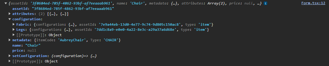
Pairing with the Composable Player
The recommended workflow of pairing the Composable Configurator with the Composable Player would be to share the assetId and asset key between them. This allows us to have a separate component for the Player and a separate component for the Form. We can then access the product configuration within each one of them through the useConfigurator hook, with the same assetId and key.
Example
In this simple case we are reusing the assetId for the key as well, and we define the key prop on the Player and Form component with the name assetKey, to avoid React errors with the reserved key prop.
Notice that in the Player.tsx file we are passing the product.configuration to the configuration prop of the configurable asset. Since the product is a state variable, whenever we change its configuration with the setConfiguration method inside the Form, the <Asset> component will automatically fetch the glTF file for the new configuration.
"use client";
import dynamic from "next/dynamic";
import { ConfiguratorProvider } from "@threekit/configurator";
const Player = dynamic(() => import("../components/Player"), { ssr: false });
import Form from "@/components/Form";

export default function Home() {
  const auth = {
    orgId: "YOUR_ORG_ID",
    host: "preview.threekit.com",
    publicToken: "YOUR_PUBLIC_TOKEN",
  };
  const assetId = "b1571ea4-e7f3-400f-ba58-b875b382a4a5";

  return (
    <main className="flex min-h-screen flex-col items-center p-24">
      <ConfiguratorProvider auth={auth}>
        <div className="flex">
          <div style={{ width: "673px", height: "550px", background: "#eee" }}>
            <Player auth={auth} assetId={assetId} assetKey={assetId} />
          </div>
          <Form assetId={assetId} assetKey={assetId} />
        </div>
      </ConfiguratorProvider>
    </main>
  );
}
"use client";
import {
Viewer,
Asset,
UnifiedResolver,
StandardPostProcessing,
ToneMappingMode,
AntiAliasingMode,
} from "@threekit/react-three-fiber";
import { useConfigurator } from "@threekit/configurator";
import MyScene from "./MyScene";
import { ThreekitAuthProps } from "@threekit/rest-api";
export default function Player({
auth,
assetId,
assetKey,
}: {
auth: ThreekitAuthProps;
assetId: string;
assetKey: string;
}) {
const product = useConfigurator({
assetId,
key: assetKey,
});
return (
<div style={{ width: "100%", height: "100%" }}>
<Viewer
auth={auth}
ui={true}
resolver={UnifiedResolver({
cacheScope: "v1",
optimize: false,
})}
>
<MyScene assetId={"b1571ea4-e7f3-400f-ba58-b875b382a4a5"} />
{product ? (
<Asset
assetId={assetId}
configuration={
product?.configuration ? product.configuration : undefined
}
/>
) : null}
<StandardPostProcessing
sao={{ intensity: 0 }}
bloom={{ intensity: 0 }}
toneMapping={{ mode: ToneMappingMode.Uncharted }}
antiAliasing={{ mode: AntiAliasingMode.MSAA, msaaSamples: 4 }}
background={{ alpha: 0 }}
/>
</Viewer>
</div>
);
}
Tip:You will need to implement your own loading visual for users to be aware that something is happening while the new glTF files are being fetched, as the load time can be several seconds in case the glTF has to be created from scratch.